Linear's Design & UX, Mapped
Linear app design is widely referenced for focus, speed and taste. This canvas maps how Linear blends marketing storytelling with product UI clarity so you can study the full journey, not only a dark-mode screenshot.
Open public canvas: Linear.app
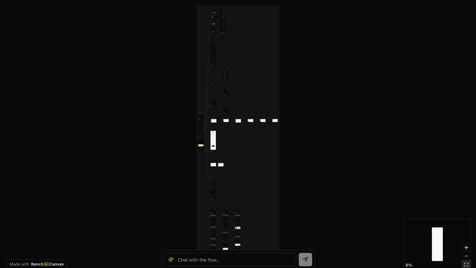
Overview
Linear’s brand promise is operational excellence for product teams. The website and product UI reinforce that promise with restrained chrome, purposeful motion and copy that assumes ambition. Mapping linear app design end to end shows how consistent that system stays across contexts.
This template is especially useful for SaaS designers who want “tasteful power-user” energy without sliding into visual noise.
Use it for competitive benchmarking, brand-system critiques, or kickoffs where engineering-led buyers are the audience.
Marketing site: story with restraint
Linear’s marketing UX rarely shouts. Sections build a narrative about modern software building while UI fragments demonstrate density without clutter. CTAs stay obvious even when the layout feels editorial.
As you move through the mapped screens, note how much whitespace and typography do versus decorative UI kits. That restraint is central to linear app design as a benchmark.
Product UI: speed and hierarchy
In product surfaces, Linear emphasizes keyboard-friendly efficiency, clear issue hierarchy and minimal ceremony. The UX communicates that the tool gets out of the way once teams are working.
Compare marketing promises to in-product patterns on the canvas. Alignment between the two is why Linear’s design feels trustworthy rather than merely stylish.
Patterns worth stealing
Steal the narrative pacing, the disciplined visual hierarchy, and the insistence that power features can still look calm. Skip hollow aesthetic cloning if your information density or audience differs. Linear app design is a system of priorities, not only a color palette.
Key takeaways
- Keep marketing and product UI on the same taste and density continuum.
- Use motion and micro-interactions to signal speed, not decoration.
- Write for ambitious teams without burying the primary CTA.
- Benchmark hierarchy and density together; pretty emptiness is not the same as clarity.
Related templates
- Stripe Design: Stripe’s marketing and product UX mapped screen by screen as a design benchmark.
- Notion Website Design: How Notion connects AI, collaboration and product storytelling in one mapped website flow.
- Music App Search UX: Spotify, Apple Music and YouTube Music search, discovery and navigation mapped as visual UX flows.