Notion's Website Design & UX, Mapped
Notion website design has to explain a flexible product without sounding vague. This canvas maps how Notion connects AI, collaboration and use-case storytelling into one coherent UX flow.
Open public canvas: Notion Website
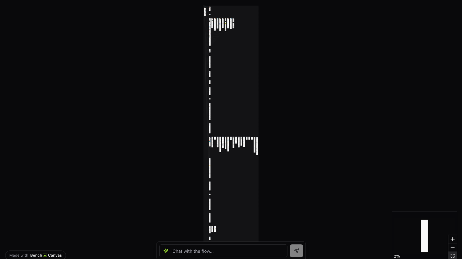
Overview
Notion sells a system that can be many things. That makes the marketing site a masterclass in framing: templates, teams, AI and personal use all need a place without collapsing into noise. Mapping the flow shows how notion website design keeps that balance.
Designers studying productivity or collaboration marketing will find concrete patterns for audience branching, product UI previews and narrative sections that still feel light.
Open the template when you need inspiration for multi-persona homepages, AI feature launches, or educating users about an open-ended workspace.
One product, many entry stories
Notion’s site repeatedly answers “who is this for?” with use-case paths and audience cues. Instead of forcing every visitor through one linear pitch, the UX offers recognizable jobs: notes, docs, wikis, projects, AI assistance.
Follow those branches on the map. Strong notion website design often depends on letting people self-identify quickly, then deepening into product proof.
AI and collaboration in the same narrative
AI features are woven into the broader collaboration story rather than stranded on an island page. That sequencing matters: visitors see intelligence as part of the workspace, not a bolted-on novelty.
Watch how demos, UI captures and benefit copy reinforce each other. The canvas helps you see where Notion teaches versus where it shows.
Patterns worth stealing
Steal the clarity of persona and use-case routing, the calm visual system, and the way flexible products are explained through outcomes. Avoid copying endless feature lists without a primary path. Notion’s site works when the visitor always knows the next click.
Key takeaways
- Give multi-persona products early self-selection paths.
- Integrate AI messaging into existing jobs-to-be-done, not only a standalone campaign page.
- Pair UI previews with outcome language so flexibility does not read as vagueness.
- Keep a primary activation path visible even when storytelling branches.
Related templates
- Linear App Design: Linear’s marketing site and product UI storytelling mapped as a visual UX flow.
- Stripe Design: Stripe’s marketing and product UX mapped screen by screen as a design benchmark.
- Nike Website Design: Nike’s journey across drops, category pages and product detail screens mapped step by step.