Stripe Design, Mapped: A Visual UX Breakdown
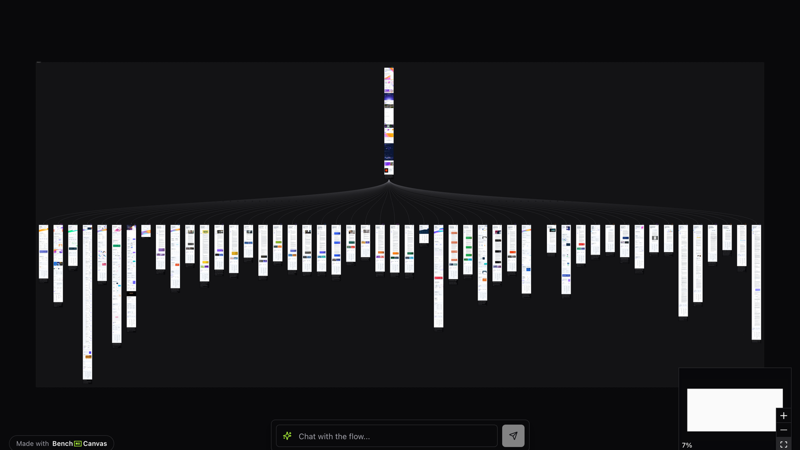
Stripe design is a default reference for B2B craft: typography, product storytelling and developer-aware marketing that still feels human. This page maps that experience as a visual UX flow you can open, study and reuse as a template.
Overview
People search for stripe design when they want a concrete benchmark, not another compliment about gradients. Mapping the site and key product surfaces shows how Stripe sequences narrative, proof and product entry points.
This canvas is for designers and PMs building developer tools, fintech infrastructure, or any marketing site that must feel both premium and precise. It turns a familiar inspiration target into a navigable flow.
Use it in critiques, hiring exercises, or kickoff workshops where “make it more like Stripe” needs to become specific: which screens, which transitions, which content modules.
Marketing narrative and hierarchy
Stripe’s marketing UX uses strong headlines, restrained motion and modular proof. The flow typically moves from a clear promise into product capabilities, customer evidence and paths into docs or signup. Nothing feels accidental about the order.
When you follow the map, notice how much work typography and spacing do before any illustration has to explain the product. That is a core stripe design lesson for teams tempted to decorate first.
Product storytelling into activation
Stripe connects storytelling to action. CTAs into dashboard, docs or products appear when the visitor has enough context, not only in a sticky header. The UX respects that infrastructure buyers skim and deep-read in the same session.
Study how feature sections, code-adjacent cues and customer logos are paced. The canvas makes it easier to see repetition with variation: Stripe rarely dumps every capability on one screen.
Patterns worth stealing
Steal the clarity of the promise, the modular section rhythm, and the way product complexity is revealed progressively. Do not steal surface aesthetics without the information architecture underneath. Stripe design holds up because the story structure is disciplined.
For implementation teams, the mapped flow is also a collaboration tool: engineering, brand and product can point at the same sequence when debating homepage scope.
Key takeaways
- Lead with a precise promise before capability grids.
- Reveal product complexity in chapters, not one overloaded hero.
- Use typography and spacing as primary brand signals, not only illustration.
- Connect marketing narrative to activation CTAs at intentional moments in the journey.
Related templates
- Linear App Design: Linear’s marketing site and product UI storytelling mapped as a visual UX flow.
- Notion Website Design: How Notion connects AI, collaboration and product storytelling in one mapped website flow.
- Fintech Onboarding: Revolut, N26 and Cash App onboarding and trust-building steps mapped side by side.