Nike's Website Design & UX, Mapped
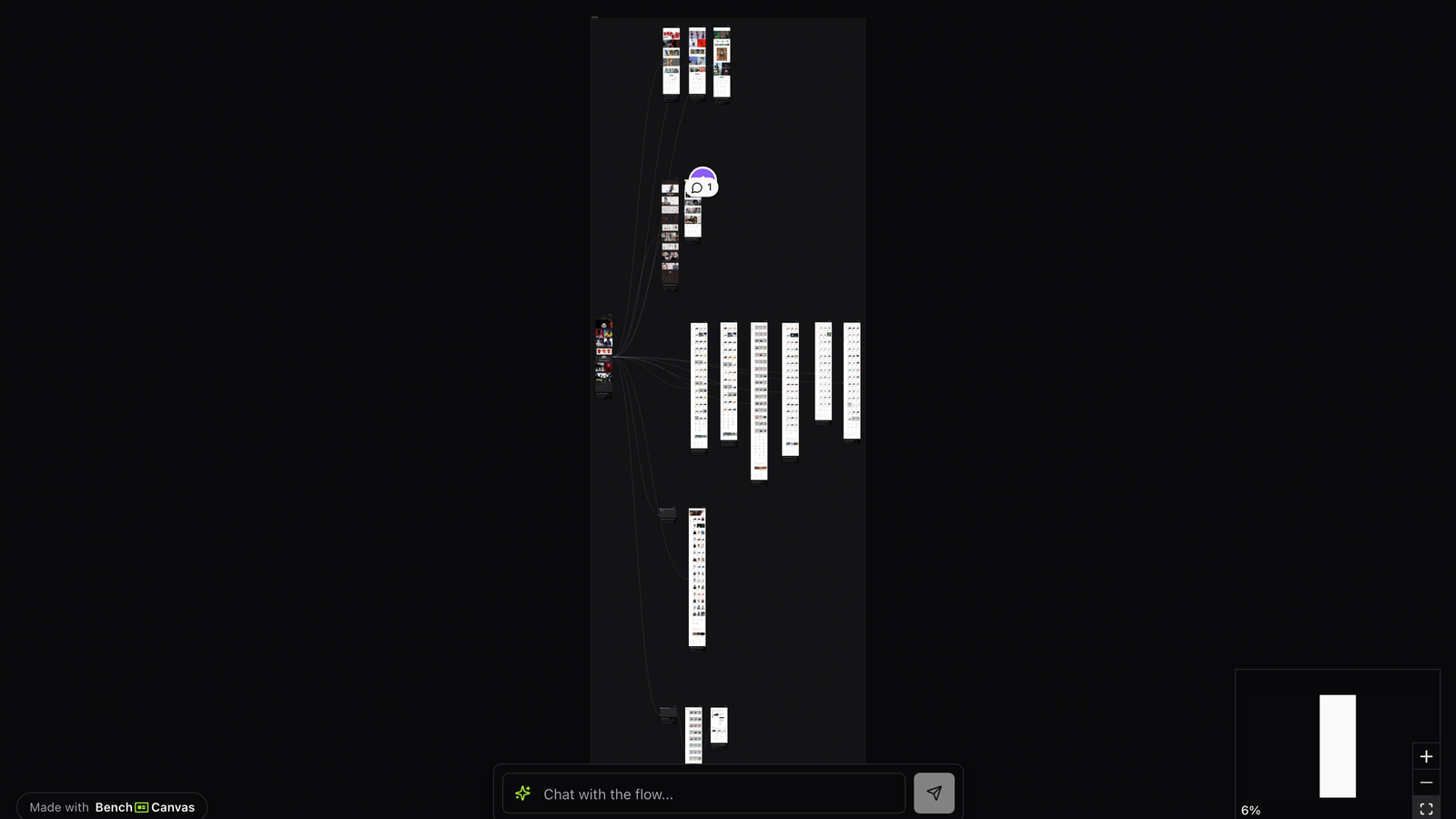
Nike website design has to move people between cultural drops, category shopping and product detail without losing energy. This canvas maps that ecommerce UX step by step so you can see how the journey is structured.
Overview
Nike’s digital experience is part store, part media brand. Visitors arrive for launches, athlete stories, sport categories or a specific shoe. Mapping nike website design helps teams understand how those intents share one navigation system.
This template is for ecommerce, brand and UX teams working on high-emotion retail. It is also useful when stakeholders want “more Nike” and you need a concrete flow to point at.
Use it to study merchandising hierarchy, PDP storytelling and how campaign moments connect back to purchase paths.
Drops and campaign entry points
Nike often routes cultural energy through featured drops and campaign modules. Those surfaces have to convert excitement into product paths quickly, or the session becomes browsing theater.
On the map, follow how a campaign moment leads into category or PDP. Strong nike website design keeps the emotional peak attached to a shoppable next step.
Category browsing and filters
Category pages carry the catalog load: sport, gender, franchise and product type. The UX challenge is helping shoppers narrow without killing inspiration. Nike’s patterns around grids, filters and editorial insertions are worth studying for that balance.
Compare category density with PDP richness. The canvas makes it obvious where merchandising ends and product storytelling begins.
Product detail and purchase confidence
PDPs combine imagery, variants, benefits and trust information. Nike’s ecommerce UX usually keeps the buy action clear while still selling lifestyle. That dual job is the heart of nike website design for conversion teams.
Patterns worth stealing include decisive primary CTAs, clear variant selection, and media that supports both desire and detail. Patterns to adapt carefully include campaign-heavy modules that can distract on high-intent PDPs.
Key takeaways
- Attach every campaign moment to a clear shoppable path.
- Design category pages for both inspiration and filtering, not only one mode.
- Keep PDP purchase actions unmistakable amid lifestyle media.
- Map drops, categories and PDPs together so merchandising and UX share one story.
Related templates
- Luxury Car Website Design: BMW, Mercedes, Jaguar, Land Rover and Lexus digital experiences mapped side by side.
- Stripe Design: Stripe’s marketing and product UX mapped screen by screen as a design benchmark.
- Notion Website Design: How Notion connects AI, collaboration and product storytelling in one mapped website flow.