Music App Search UX: Spotify vs Apple Music vs YouTube Music
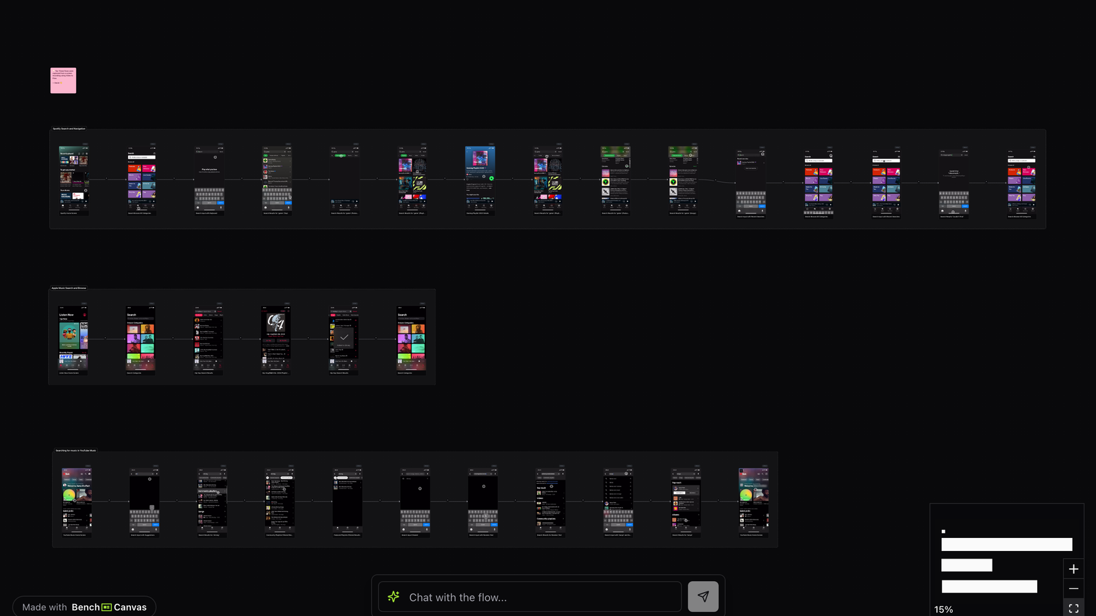
Music app search UX is where catalog scale meets impatience. This canvas maps Spotify, Apple Music and YouTube Music so you can compare how each handles query entry, results, empty states and the jump into playback or related discovery.
Open public canvas: Music App Search
Overview
Search is the recovery button of music products. When browse fails, users type. That makes music app search UX a high-stakes surface: ranking, entity types (songs, artists, albums, playlists, podcasts) and keyboard-friendly shortcuts all show up in the first few screens.
This template is for product designers and PMs building media search, discovery or navigation. It turns three mature apps into a comparable visual flow instead of a pile of disconnected screenshots.
Open it when you need inspiration for query suggestions, result grouping, voice-adjacent search patterns, or how quickly a search session becomes a listening session.
Spotify: fast intent matching
Spotify’s search experience prioritizes speed and familiarity. Recent searches, trending queries and strong entity cards help users land without perfect spelling or full titles. Results often mix top hits with categories so a single query can branch into artist pages, playlists or songs.
Watch how Spotify keeps the path from result to playback short. Music app search UX succeeds when the result list feels like a launchpad, not a research tool. Spotify’s structure rewards that habit repeatedly.
Apple Music: catalog clarity
Apple Music tends to present search with cleaner type hierarchy and tighter entity separation. The experience can feel more bibliographic: albums, songs and artists are easy to parse, which helps users who already know what they want.
That clarity is useful if your product serves collectors or high-intent searchers. Compared with Spotify, Apple Music’s flow is less “always suggest something new” and more “help me find the exact thing cleanly.”
YouTube Music: video-native discovery
YouTube Music inherits a video-shaped mental model. Search results and adjacent discovery often lean on visual thumbnails, official uploads and the broader YouTube graph. Navigation between search, related content and listening sessions can feel more exploratory than library-first.
If your product mixes audio with video or UGC adjacency, this branch of the canvas is the one to study. It shows how music app search UX changes when the unit of content is not only a track metadata record.
What they do differently
Spotify optimizes for rapid matching and habit loops, Apple Music for structured catalog lookup, and YouTube Music for visually led exploration. Your takeaway should not be “copy one UI.” It should be choosing which search philosophy matches your users’ intent mix, then designing result modules accordingly.
Key takeaways
- Separate high-intent exact matches from exploratory suggestions so neither crowds out the other.
- Group results by entity type early; mixed lists get noisy once catalogs grow.
- Measure time from query to first play, not only search click-through.
- Study empty and partial-query states; they reveal how forgiving the product really is.
Related templates
- Streaming App UX: Disney+, Hulu and Apple TV side by side: browsing, discovery and playback mapped screen by screen.
- Notion Website Design: How Notion connects AI, collaboration and product storytelling in one mapped website flow.
- Nike Website Design: Nike’s journey across drops, category pages and product detail screens mapped step by step.