How Disney+, Hulu & Apple TV Design Streaming UX
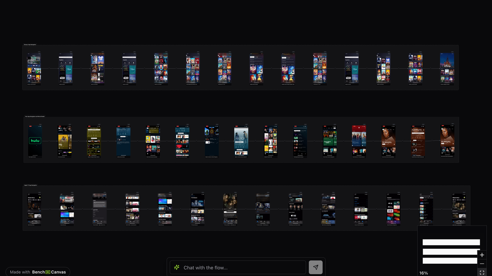
Streaming app UX looks simple until you map it: every brand has to move people from browsing to discovery to playback without losing them. This canvas compares Disney+, Hulu and Apple TV as visual UX flows so you can see how each designs that journey.
Open public canvas: Streaming apps
Overview
When people search for streaming app UX examples, they usually want more than pretty home screens. They want to understand how catalogs are organized, how titles get promoted, and how playback starts without friction. A side-by-side flow map makes those decisions visible in one place.
This template is built for designers, PMs and researchers who benchmark entertainment products or redesign browse experiences. Instead of scrolling screenshots, you get a connected map of the same problem solved three ways.
Use it when you need competitive inspiration for TV and mobile streaming, paywall-adjacent browse patterns, or a shared artifact for critique with stakeholders who think in journeys, not isolated frames.
Disney+: franchise-led browsing
Disney+ leans hard on brand worlds. The home experience clusters content around franchises and franchises-within-franchises, so discovery often starts from identity (Marvel, Star Wars, Pixar) rather than a generic genre shelf. That makes the catalog feel curated even when inventory is huge.
Pay attention to how rows, hero placements and continue-watching modules stack. Disney+ treats the first few screens as a map of IP territory, then narrows into title detail and playback. For teams designing streaming app UX, the lesson is clear: strong brand architecture can reduce search dependency if browse is intentional.
Hulu: flexible discovery and live adjacency
Hulu’s flows mix on-demand browsing with live and promotional surfaces. The UX often feels more editorial and opportunistic: recommended rails, temporary campaigns and mixed content types compete for attention on the same canvas.
Compared with Disney+, Hulu’s streaming app UX is less about a single franchise tree and more about keeping multiple entry points warm. That shows up in how search, categories and personalized rows sit next to each other. If your product has both library and live/appointment viewing, Hulu is a useful reference for balancing those modes.
Apple TV: clarity and system-level polish
Apple TV’s experience emphasizes hierarchy, focus states and a calmer information density. Title presentation, metadata and navigation feel closer to a system product than a noisy content marketplace. Playback and up-next patterns stay predictable once you leave the browse layer.
Studying Apple TV beside the others highlights a tradeoff every streaming product faces: more promotional density versus more cognitive ease. The canvas makes that tradeoff concrete because you can follow the same user job across all three brands.
What they do differently
Disney+ organizes around worlds, Hulu around flexible discovery surfaces, and Apple TV around restrained hierarchy. All three still solve browse → detail → play, but the emotional and structural cues differ. Looking at streaming app UX this way helps you decide whether your product should feel like a brand park, a living magazine, or a precise catalog, before you redraw a single screen.
Key takeaways
- Decide whether browse should lead with brand worlds, personalized rails, or calm hierarchy before designing individual screens.
- Map continue-watching and up-next early; they often determine whether playback feels sticky or accidental.
- Compare the same user job across competitors so promotional density does not get mistaken for better UX.
- Use a shared flow canvas in reviews so stakeholders critique journeys instead of isolated hero art.
Related templates
- Music App Search UX: Spotify, Apple Music and YouTube Music search, discovery and navigation mapped as visual UX flows.
- Fintech Onboarding: Revolut, N26 and Cash App onboarding and trust-building steps mapped side by side.
- Stripe Design: Stripe’s marketing and product UX mapped screen by screen as a design benchmark.